

When it comes to selecting paint colors for a room, you will want to ensure that the shade you select will seamlessly complement your wallpaper and curtains—but what are the most important factors to keep in mind during this process? We spoke with interior designers who weighed in on what to pay close attention to before grabbing that paint brush.
Skip Plain White
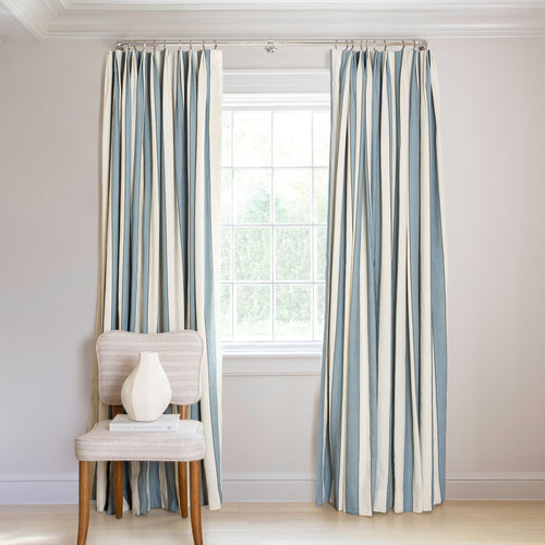
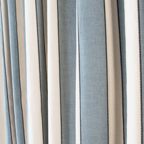
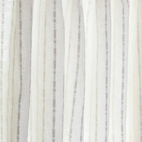
This is key in rooms with wallpaper, according to designer Adnan Anwar. “When working with wallpaper, especially patterned wallpaper, I think white trim gets lost,” Anwar says. “I recommend pulling a secondary color from the pattern to use on the trim.” Steering clear of the primary color is ideal, particularly if you’re a perfectionist. “When you pull the primary color, or the ground, it can be really hard to precisely match—especially as the light changes throughout the day,” Anwar notes.

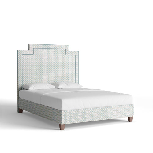
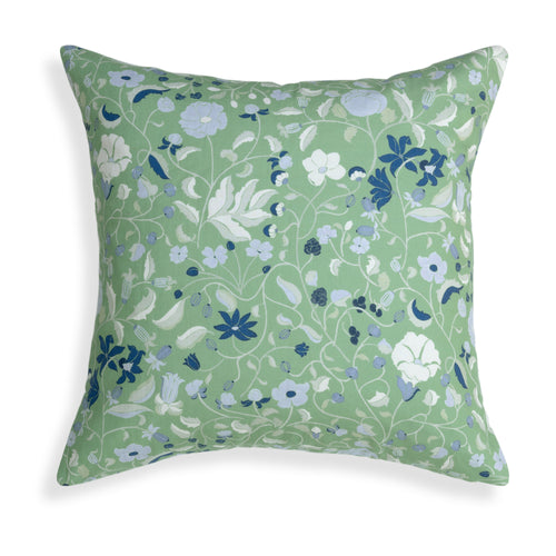
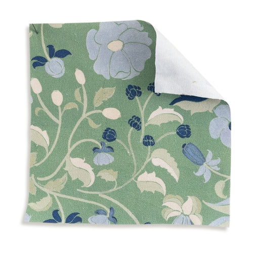
Designer Maggie Stephens agrees. “I like to layer a lot of different textures and patterns, and often pulling the paint color from the subtle accent in a wallpaper or fabric can really tie the whole look together,” she says. Or simply play favorites, as designer Lexi Brandfon does. “Sometimes, when a wallpaper has multiple colors, I try to match a color from the best part of the design to really highlight it,” she comments.

Either way, you’ll want to apply paint swatches to your walls before committing to a color, notes Stephens. “Check your top three choices on each wall, and ideally in both natural light and artificial light,” she advises. “Don’t just rely on the tiny squares from the hardware store. Buy a sample pot of paint or order a big swatch from a site like Samplize.com.” And note that you can order swatches of your curtain or wallpaper straight from Pepper, too. This makes it easy to visualize how specific hues and patterns will appear alongside a particular paint color prior to making any big commitments.
Think About A Room's Use
In addition to keeping the above advice top of mind, you will want to think closely about a room’s function and what colors may be best suited to, say, a sleep space versus a family room. “Softer colors in bedrooms are usually calming,” designer Colleen Simonds says. “I like lavenders and soft pinks with a lot of gray in them so you can’t really tell what color they are.” In a place like a powder room, darker paint is an optimal pick, Simonds adds. “Just go all in on the cozy factor—and don't worry if there isn't much natural light, just lean into it.”

Do Something Unexpected
Maybe you’re someone who enjoys thinking a bit outside the box when decorating, in which case you may wish to look at your wallpaper or fabric and go lighter, Simonds recommends. “A really beautiful blush or pale pink paint could ground wallpaper or fabrics with reds or browns,” she notes. “Shades of green paint are beautiful with neutrals, black, blues, yellows—so many options!”
