Blue is a timeless color and is one of our favorites here at Pepper—our textiles feature soft blues, navy blues, cornflower blues, blue grays, and much more, meaning there’s truly a shade for everyone. First things first, though, you’ll want to determine your desired mood for a room before landing on a specific blue to use. “Lighter blues evoke a serene and airy feeling, while darker shades of blue can add depth and drama to your space,” explains Molly Hirsch, the founder of Molly Hirsch Interiors. “Blue in design can be so many things: fresh, playful, traditional, dramatic, soft, soothing, bold, preppy, edgy, modern, et cetera,” Hirsch comments, adding that blue has been named the most popular color worldwide. “Blue in our homes can evoke that same feeling we get when outside on a sunny day or at the beach—calmness and relaxation—so it’s no wonder it’s on top of the favorite colors list!”
The good news is that no matter what shade of blue you select, you’ll have plenty of options when it comes time to design your space. “Blue almost acts like a neutral and can pair with nearly all colors,” Hirsch says. It can be bright and fun when paired with orange, yellow, or pink, while it turns sophisticated when paired with neutrals like creamy whites, beiges, and grays.” Below, read on to learn more about designers’ favorite ways to make blue spaces shine.
Pair Solid Blue with a Print
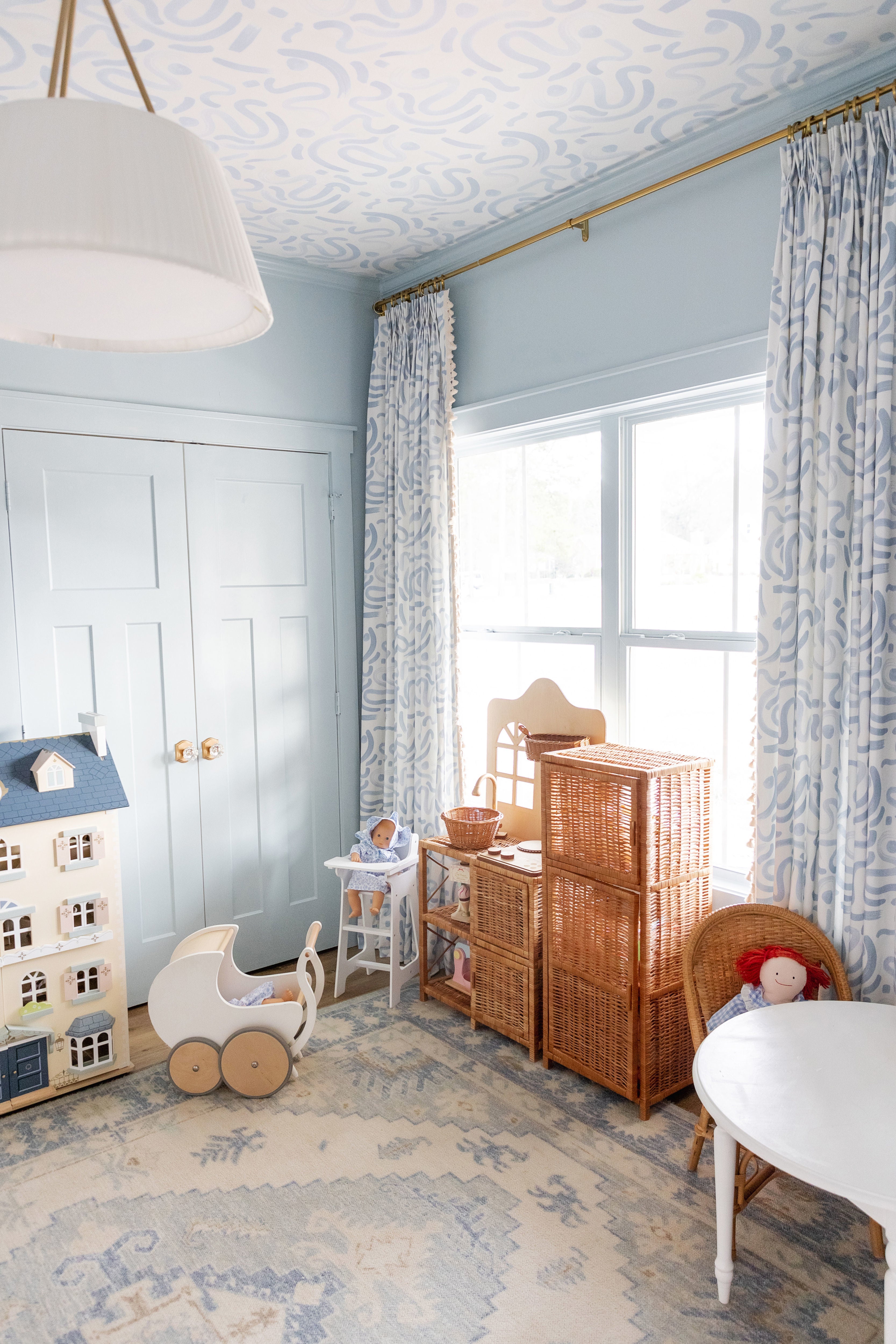
Kristina Petit, the founder of Kristina’s Collective Interiors likes to pair blue walls with a corresponding print. When working with blue paint, she covers the walls and the trim in a space “to create warmth and intimacy.” Petit envisions pairing a deeper blue with Emma Sky wallpaper to add some contrast to a space.

Design and photography by McKenzie Fussell
Look to the Color Wheel
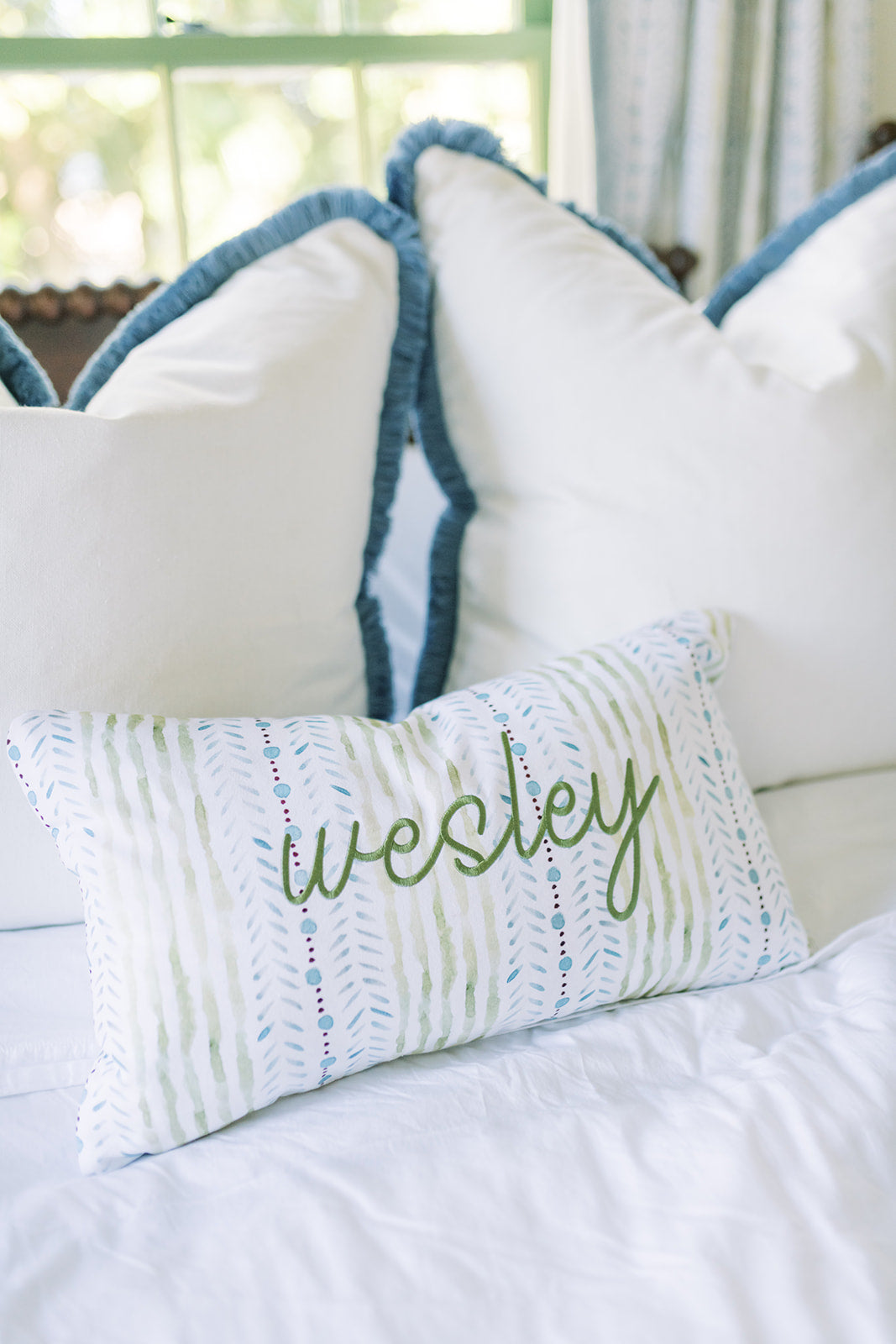
When looking to mix blue with other colors, Jessica Stambaugh, the founder of JS Interiors suggests revisiting the color wheel for inspiration. Complementary colors, such as yellow and orange, make for excellent accents, she explains. “Greens, with yellow undertones, like Hockney Moss, can create some positive tension, too,” the designer adds.

Design by Sarah Tucker
Use Blue as an Accent
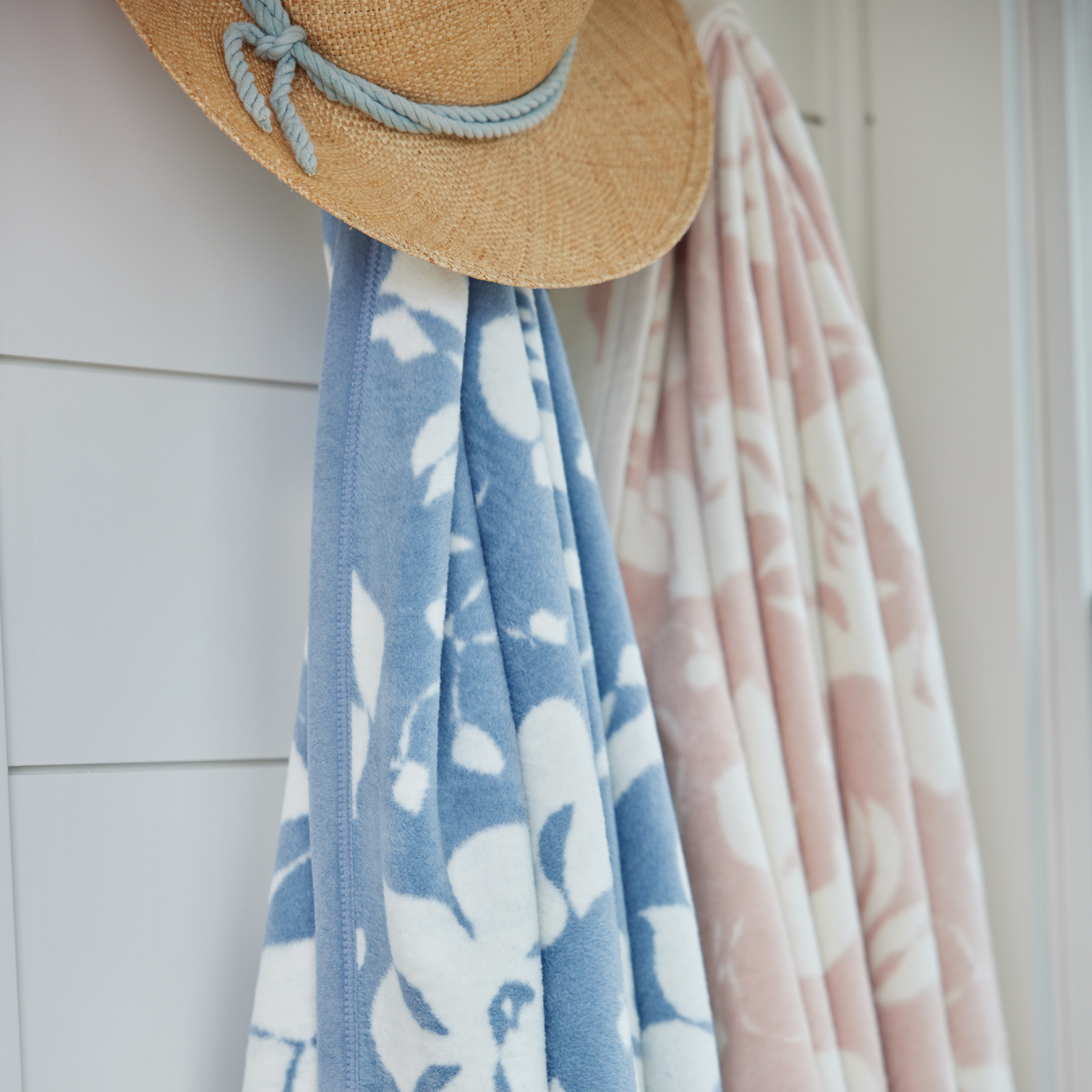
Prefer to keep your blue touches a bit more subtle? Blue still makes for a great accent color, according to Hirsch—just shop for blue pillows, artwork, or blankets. “Accessories are a great way to infuse color and personality into your room,” she says.


