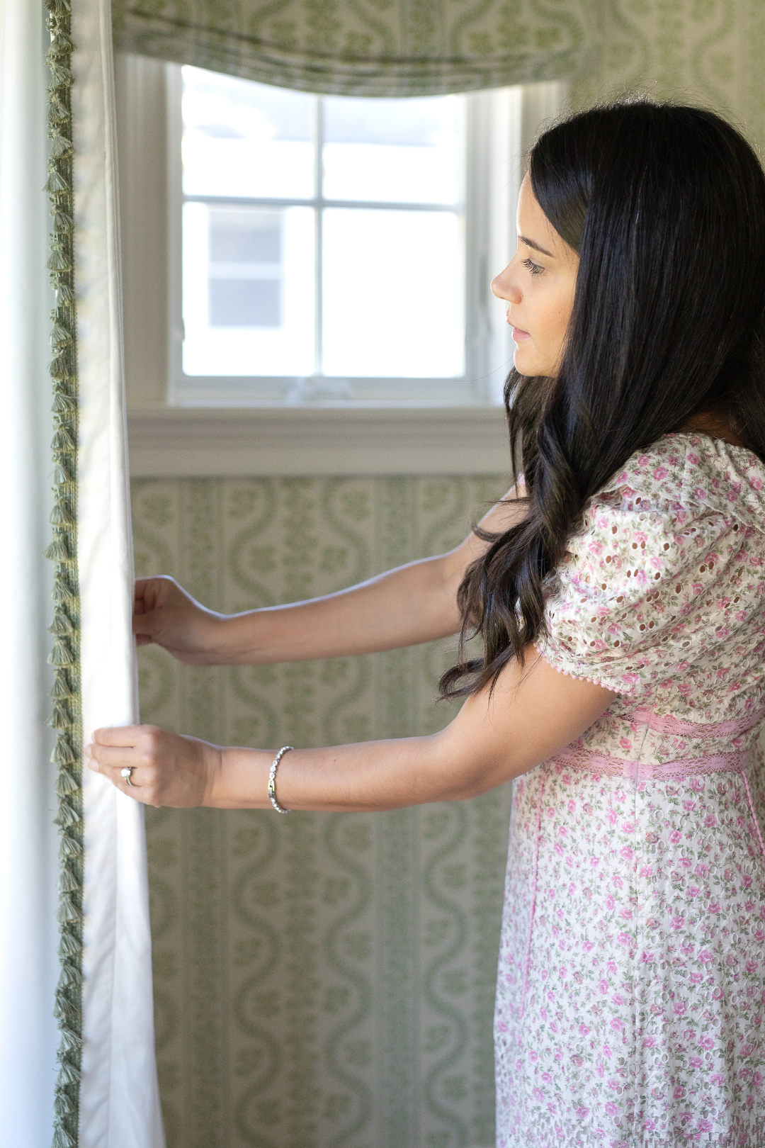
Connecticut-based blogger, Chanel Pazda, designed her daughter's nursery using our Flour Curtains with Sage tassel trim. We love how the sage trim detail perfectly compliments the Sister Parish wallpaper she chose as the backdrop. Follow along to learn more about how Chanel designed a space that will grow with her little one!
First off, tell us a little bit about yourself!
Raised in Chicago, I made my move to NY right after high school for college and never left the East Coast. I lived in NYC for over 10 years, and that’s where I launched my career and met my husband. We now live in Greenwich, CT with our soon to be 2 year old daughter, Colette.
I am a marketer by profession and when I launched my blog, Coco on Fifth, I wanted to help my audience live elegantly across the world of home and fashion. It has certainly evolved but my core mission and values remain the same. I love showing that elegance can be achieved in an effortless way and you do not need to spend a fortune on every single item at home or your closet. I am a strong believer that you can attain classic style at any budget. Mixing high and low is one of the things I love to do the most. I seek inspiration from so many places and things but my favorites are from traveling (especially France, Paris is my favorite city), museums, reading from the people that inspire me and publications, and exploring different cultures.
Recently, I started my interior design business, Coco on Fifth Designs, and I am completing a certificate for Interior Design at Pratt Institute. Looking forward to seeing what the future holds for my brand as I continue to grow it!
How would you describe your style?
I would say that my style is a little bit traditional, a little bit British, and a little bit edgy eclectic- I'm drawn to classic lines, shapes, and architecture, and I'm always on the hunt for that perfect vintage piece. I love layering in cozy fabrics and patterns- this is where my British sensibilities sneak into my designs. I'm a total Anglophile, and find so much inspiration in travel and history.

What was the design vision for your daughter's nursery?
I wanted her nursery to feel classic and feminine, reflecting the overall traditional style of our home. I wanted it to be a space my daughter, Colette, could grow into. The hero of the room is the Dolly wallpaper by Sister Parish. It brings a sense of traditional fresh charm to any space it’s used in. I am hopeful she will love the wallpaper as much as I do, and I’m excited to continue building beautiful memories with Colette in her special space.

What drew you to our Flour Curtain with Sage tassels?
I picked the wider panel length because I wanted her window space to feel wider than it actually is so the room feels bigger. I love the color combination I chose. The ivory color of the fabric with the delicate sage tassel trim adds balance and excitement to the room in a subtle and traditional way. Going through the ordering process was easy and the team at Pepper Home was so wonderful to work with, it made everything feel enjoyable!

What tips do you have for designing a space that will grow with your little one?
I think it’s so important to design a room that reflects your style but is also practical, especially a nursery. You are going to be in that room with your little one a lot, so make sure the layout is one that is going to be functional.
When choosing the style you want, I recommend one that you think your baby girl or boy can enjoy for the next 10-15 years. Pick colors and patterns for big investment pieces such as dressers, wallpaper, and drapery with this in mind.

If you’re on a budget, invest in the pieces that you are going to have for a long time. You don’t need to spend a lot of money on everything in your nursery. In Colette’s room, I invested in her dresser but chose a more affordable crib because I knew she would only be using it for several years. I also recommend investing in window treatments. Keeping it neutral, such as the combination I chose with Pepper Home, will allow you to keep it for many years to come even if you change wall colors and accent pieces.

Make the space special by incorporating photos and meaningful objects. I am excited to begin adding these elements in Colette’s room as she gets older and we collect special items and photos gathered through our travels and time together.
We love everything about this room! Can you tell us about some of the other design elements in the space?
I really love the dresser that I chose for Colette because it adds a european touch to the space. A special piece in the room is an iron bench that I had in my room when I was little where we keep a few books and stuffed animals. It’s the perfect piece to add something old from my childhood to the mix. We can’t forget the mix of patterns and colors. I really wanted to do a green and pink room (I have an obsession with green). I really like how the sage color of the Sister Parish wallpaper goes so well with the floral print fabric by Schumacher on her ottoman and matching pillow.


